1.4.11: Non-Text Contrast
Non-text Contrast is a Web Content Accessibility Guidelines 2.1 Level AA success criterion and states that the visual presentation of user interface components and graphical objects should have a contrast ratio of at least 3:1 against adjacent colours.
The intent of this success criterion is to ensure users with visual impairments can perceive parts of the screen that aren’t necessarily text but are important for accessing and understanding content. They need a good contrast ratio to fully differentiate between components and use them properly, especially if the user has a colour vision deficiency that lowers contrast further.
Using a proper colour contrast of 3:1 or greater can make page content more distinguishable and ensure ease of navigation and practicality without the need for contrast enhancing tools.
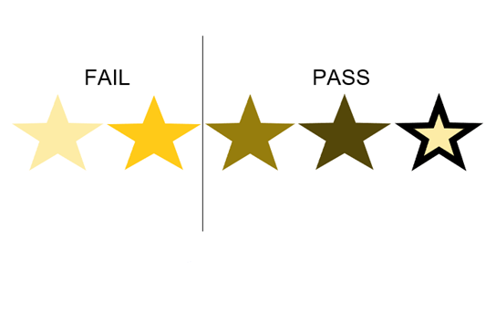
This criterion applies to active controls and their state. For example, a link and a visited link must be distinguishable from the adjacent page background and surrounding text. Buttons, input fields, checkboxes, toggle buttons, dropdown indicators, and radio buttons must all have a contrast ratio of at least 3:1 with adjacent colours. In the graphical objects category, we can find icons (phone, cart etc.), symbols (£, $ etc.), charts and infographics (pie chart, column chart etc.) that must have proper colour contrast. There are different ways each component can comply with this success criterion.
There are a number of tools online that can be used to test contrast ratio quickly and easily. These tools are primarily for checking foreground and background colour combinations to help determine if contrast ratio is sufficient. Colour contrast analysers can also simulate different colour combinations that allow you to check if the colours to be used meet WCAG success criteria.
Exceptions to the rule do not have to meet the contrast requirements if “a particular presentation of graphics is essential to the information being conveyed”. In this category we can find inactive (i.e., disabled or ‘greyed out’) UI components, brand logos, screenshots (e.g., visual demonstrations), flags, photography, heatmaps and so on.
Other situations where changing the colours changes the meaning of the graphic are exempt from this requirement too.
As part of our consultations, accessibility audits, and training sessions, we can explain all the contextual nuances that would apply to the WCAG 2.1 Success Criterion 1.4.11 Non-text Contrast. If you have any questions or need help with any digital accessibility issue, please don’t hesitate to contact IA Labs.
IA Labs DAC. Copyright © 2022. All rights reserved. Company registered in Ireland No. 693460.
Registered Office: Whitworth Road, Drumcondra, Dublin 9. Tel: +353 1 224 8086