IA Blog

Inclusion & Accessibility

1.4.5: Images of Text

Well-presented, eye-catching images of text and infographics have been used for a long time to get information across to users. However, they can be a detriment to the accessibility of a website or a digital document.

Pile of 20, 100, and 200 euro bills

The National Challenge Fund for Green Transition and Digital Transformation

The Minister for Further and Higher Education, Research, Innovation, and Science announced the launch of the National Challenge Fund on 8th August 2022. The research fund is worth 65 million euro and asks researchers to develop solutions to 8 key challenges to Ireland’s Green Transition and Digital Transformation.

Online application form being filled out on a laptop

Designing Accessible Forms – What you need to know

Forms are ubiquitous on website and apps and needed for all sorts of things, but are also one of the most common places accessibility problems occur. In this article, we go through all the ingredients of creating an accessible form that provides the best experience for all users.

Brown shopping bags filled with food groceries

Digital Accessibility in Food Retail

Imagine if you were in a situation where it was not an option for you to go to a shop and a food retailer’s site was not accessible. People with disabilities deserve to have easy access to online groceries and meet one of their basic human needs.

Person shopping online on a clothes website

How to improve the accessibility of your e-commerce site

The popularity of online spaces has spiked in the last few years and given us the opportunity to buy and sell products and services easily, with faster than ever access to an increased number of options. However, people with disabilities find many e-commerce sites very hard to use.

Person typing on their laptop

The Scoring System of Ireland’s First Monitoring Report

This blog offers a breakdown of the types of reviews performed and the scoring system used in Ireland’s first monitoring report, published in December 2021 by the NDA.

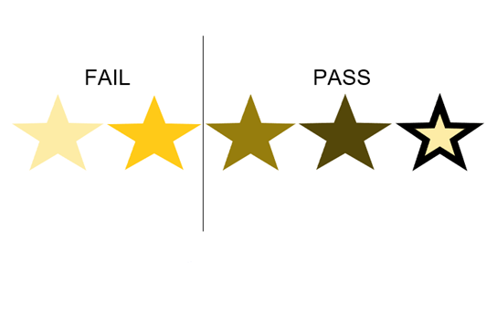
Star icons in different shades of yellow, split into 2 groups pass and fail

1.4.11: Non-Text Contrast

Non-text Contrast is a WCAG 2.1 Level AA success criterion and states that user interface components and graphical objects should have a contrast ratio of at least 3:1 against adjacent colours.