This year marks the 21st anniversary of WCAG, which have evolved into the gold standard for organisations across the world that want to ensure their websites, apps and digital content are fully accessible to all users. Let’s go on a journey through the history of WCAG.
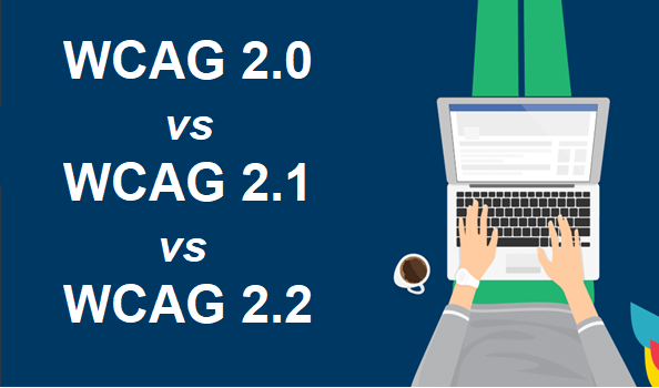
A History of the Web Content Accessibility Guidelines