Why Colour Contrast Matters

Colour contrast is defined as the difference in brightness between foreground and background colours. In the case of digital accessibility, foreground colours are the colour of text, links, and user interface components.
For best practice, you should choose a colour scheme for your digital assets that has a high contrast between foreground and background, e.g. if you have a dark background, the text should be a light colour. Black and white are known to provide the highest possible contrast, with a contrast ratio of 21 to 1.
High contrast combinations are important because about 300 million people worldwide have problems with colour vision. They will find it difficult to tell the difference between red and green, green and brown, blue and purple, and so on. However, most people with colour blindness are still able to perceive contrast. If you must use the previously mentioned colour combinations, changing the colour shades so that one is very dark and the other is very light helps everyone to tell the colours apart.
After choosing a colour scheme for your website, there are many online tools that you can use to check their contrast, such as WebAIM. WebAIM’s Colour Contrast Checker allows you to select colours using an eye dropper or by typing either the HTML hexadecimal colour code or red-green-blue (RGB) colour values into a box. The contrast ratio is then calculated for you; using exact colour codes or RGB values gives a more accurate result as opposed to the eye dropper tool.
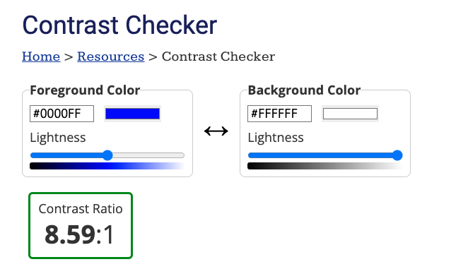
In the following example of WebAIM’s Colour Contrast Checker, blue (colour code #0000FF, or 0% red, 0% green, and 100% blue) has been used as the foreground colour and white (#FFFFFF, or 100% red, 100% green, and 100% blue) has been used as the background colour. Their contrast ratio is 8.59 to 1. WebAIM also allows users to change the lightness of their selected colours using sliders to quickly see how this affects the contrast ratio.
In level AA of the Web Content Accessibility Guidelines, Success Criterion 1.4.3 calls for a colour contrast ratio of at least 4.5 to 1 between text and its background. Anything below 4.5 to 1 would be considered a failure to meet digital accessibility standards. This ratio was chosen to ensure people with colour vision difficulties can tell colours apart and read and interact with content easier. Large-scale text however only needs to meet a ratio of 3 to 1, while text that is part of logos are exempt from contrast requirements.
Colour contrast has a huge impact on website and mobile app users; it changes the readability of a webpage, especially for those with low vision, colour blindness, or learning difficulties such as dyslexia. It can be confusing and frustrating trying to navigate a webpage that has unreadable content because of its colour scheme.
Having good colour contrast on your website means that all users can view content without having to worry about missing out on important information. Contact IA Labs today for more advice and information on how colour contrast can improve digital accessibility.
IA Labs DAC. Copyright © 2022. All rights reserved. Company registered in Ireland No. 693460.
Registered Office: Whitworth Road, Drumcondra, Dublin 9. Tel: +353 1 224 8086